CREATED FOR @THEGROWANDGLOWCLUB
BRIEF
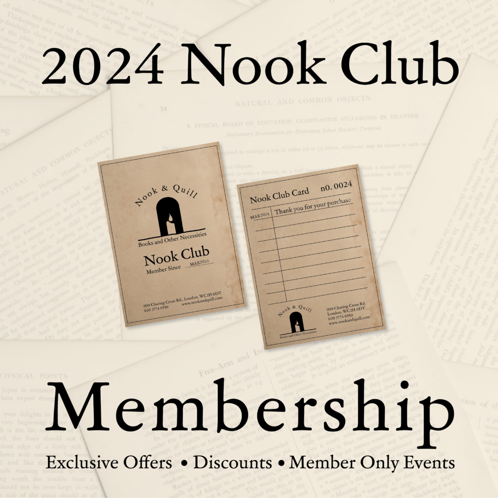
Nook & Quill was created as a passion project inspired by the Grow and Glow Instagram Challenge. It is a brand identity that exudes warmth, simplicity, and whimsy. It is cozy, comfortable, friendly, and familiar just as any good bookshop should be.
THE LOGOMARK
Candlelight has been the companion of reading for centuries before the wide use of electricity. Throughout history people read in darkness, slowly, concentrating, sensitive to the subtle interplay between what was on the page and what appeared to be on the page.
Today, people continue this practice to turn off the electronic world around them. They intentionally unplug and light up so they can settle into a different world on the page.
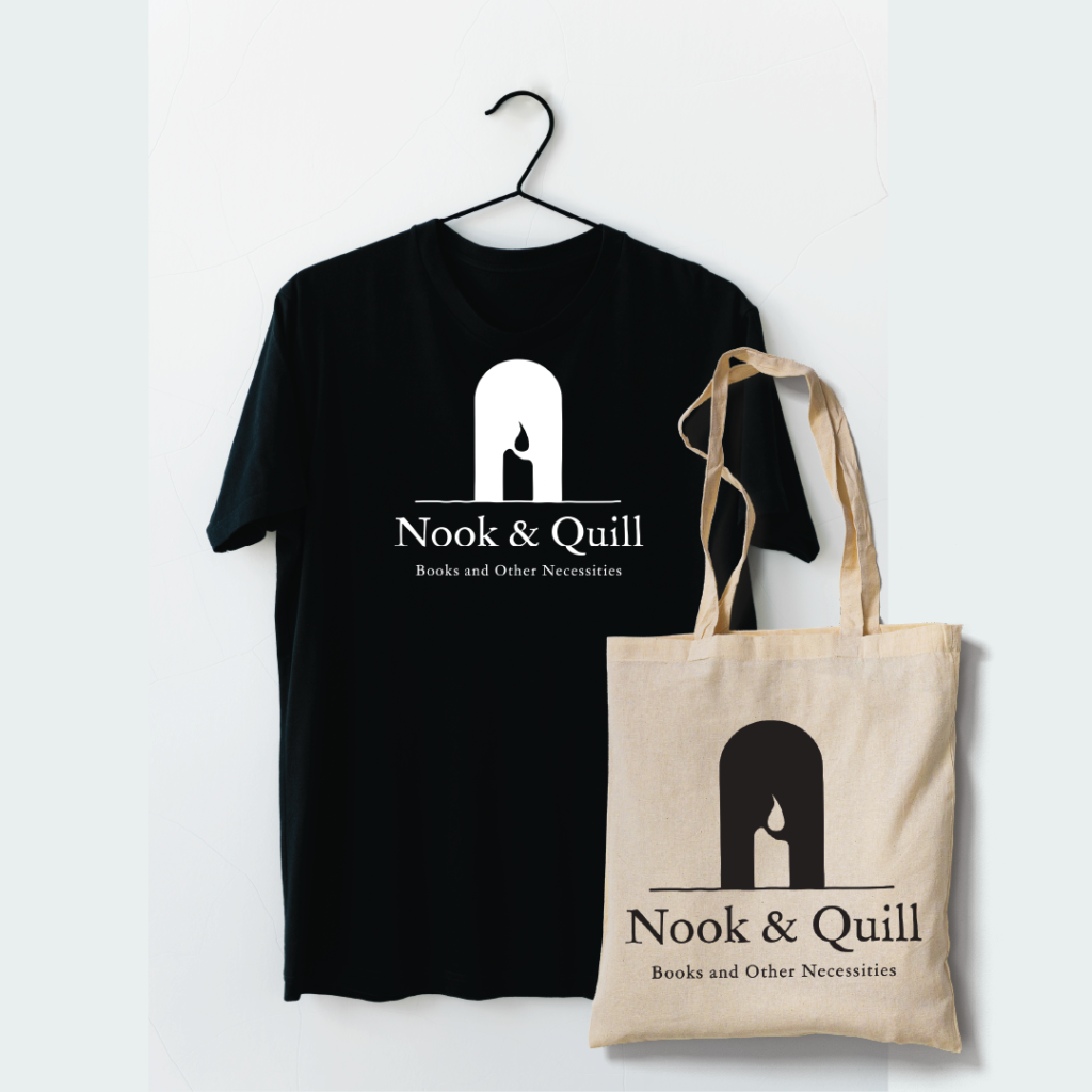
The Nook & Quill logomark brings them into that familiar old feeling. A feeling of time standing still. A moment of peace to lean into what is between the covers of a favorite book.
TYPOGRAPHY & ILLUSTRATIONS
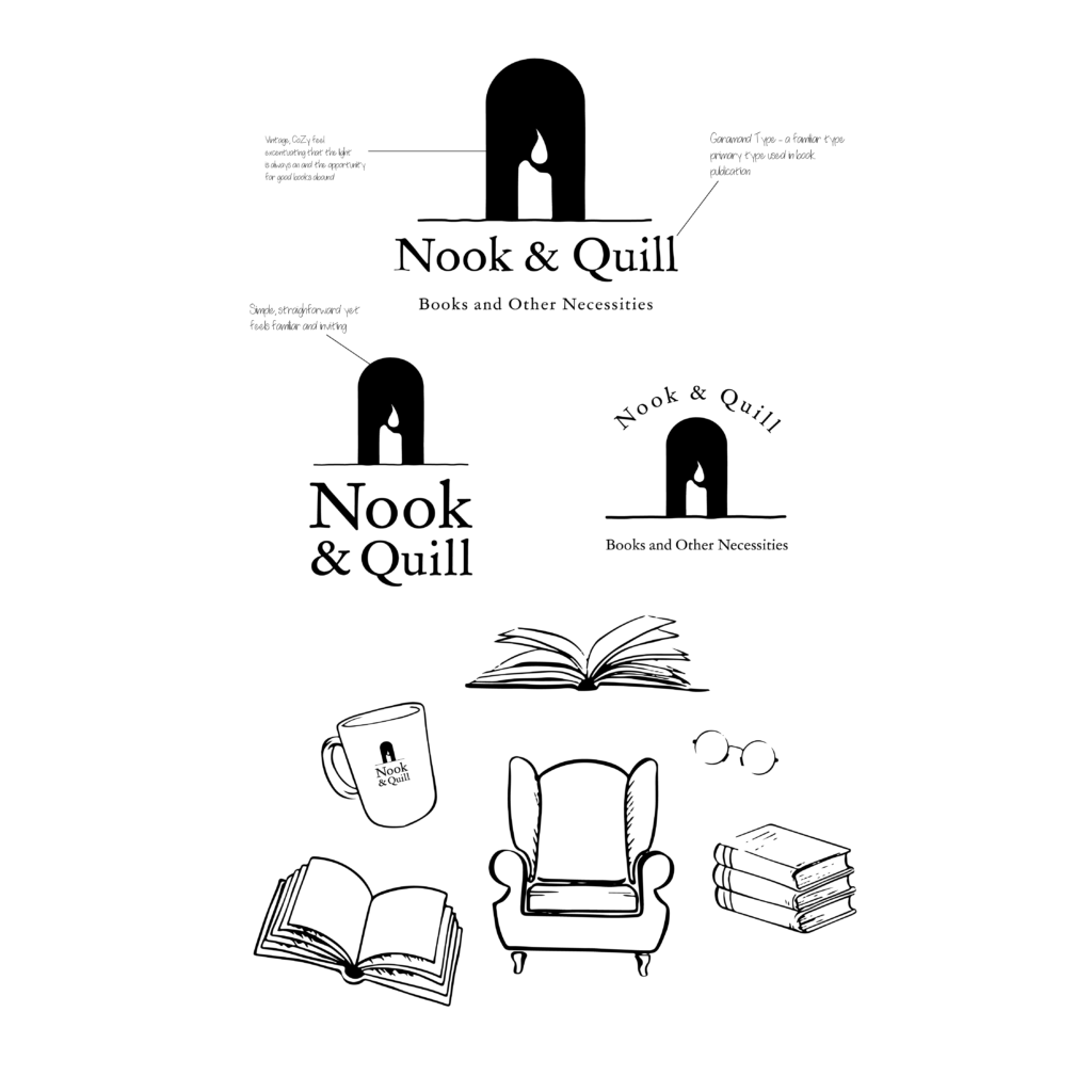
The Nook & Quill font is GARAMOND. This is the most popular font used in book publishing. The font has been customized to give it a more time-old, comfortable feel while keeping the readability of the font.
The illustrations are hand-drawn furthering the feel of the comfortable, friendly, and familiar identity of the brand. Each one is a common companion of serious readers.
ASSETS
Jami Thornsberry Designs creates memorable brand experiences through compelling storytelling. To book your project inquire here.
